
Logo Changes and Brand Updates
By Caliber Creative
It seems like every brand has been doing it lately.
Companies like Google, Uber, Instagram, and more have made big changes, if not a complete overhaul to their logo in the past year. Each expressing different reasons for the changes. One perk of updating your brand is the publicity that comes with it. But sometimes it doesn’t go over so well with your devoted customers.
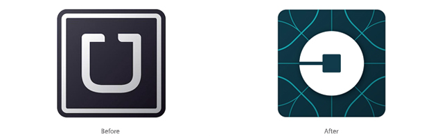
Uber
Uber’s goal when updating their logo after 4 years was to provide “A new look and feel that celebrates our technology, as well as the cities we serve,” according to the CEO Travis Kalanick. Some fans of the company celebrated the update since it was something the staff felt like they had to do. Others tore Uber apart for fixing something that wasn’t broken.
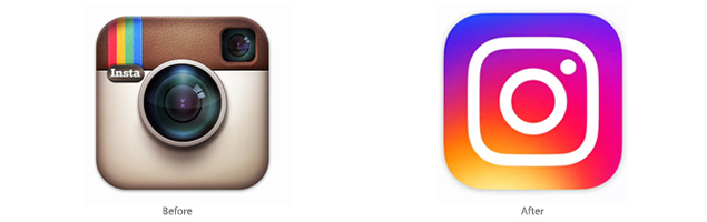
Instagram’s goal when making their logo update after 5 years was to “Reflect how the app has transformed since it was first created,” according to their company blog. Again some customers were thrilled by the update. While others were disappointed with the company changing something they felt was unique and integral to the Instagram brand.
At Caliber we’ve been a part of some rebranding and logo updates ourselves. Unlike the previous examples we didn’t experience any dissatisfaction from customers. Most were thrilled we brought their favorite brands into the 21st century.
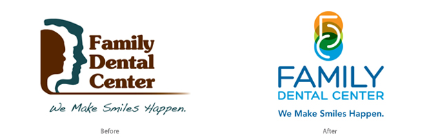
Family Dental Center
This logo and brand update has been a huge success. Apart from changing the Icon we updated the color scheme and added new brand elements. Now customers feel like they are getting the most modern and up to date treatment the brand reflects.
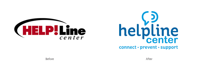
Helpline Center
This non for profit client has multiple facets of their brand. Many of which we updated along with their main logo. The original logo didn’t clearly communicate the value they were offering to the community. We did a complete overhaul and updated the color scheme, font type, service line and added some fun brand elements. Now their logo clearly communicates the different types of services they offer and provides a clean schematic for marketing materials.
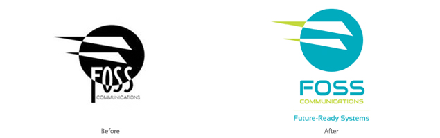
Foss Communications
This is one of our most recent logo and brand updates. The original logo was something unique and special to the owner. We kept the shapes and elements and refreshed the color scheme and fonts as well as adding a service line. To complete this update we will be installing vehicle wraps with tons of pop and color. Now their brand represents the most up to date technologies they offer.
If your company is thinking of doing a logo update or brand change – we’d love to help!